< Back
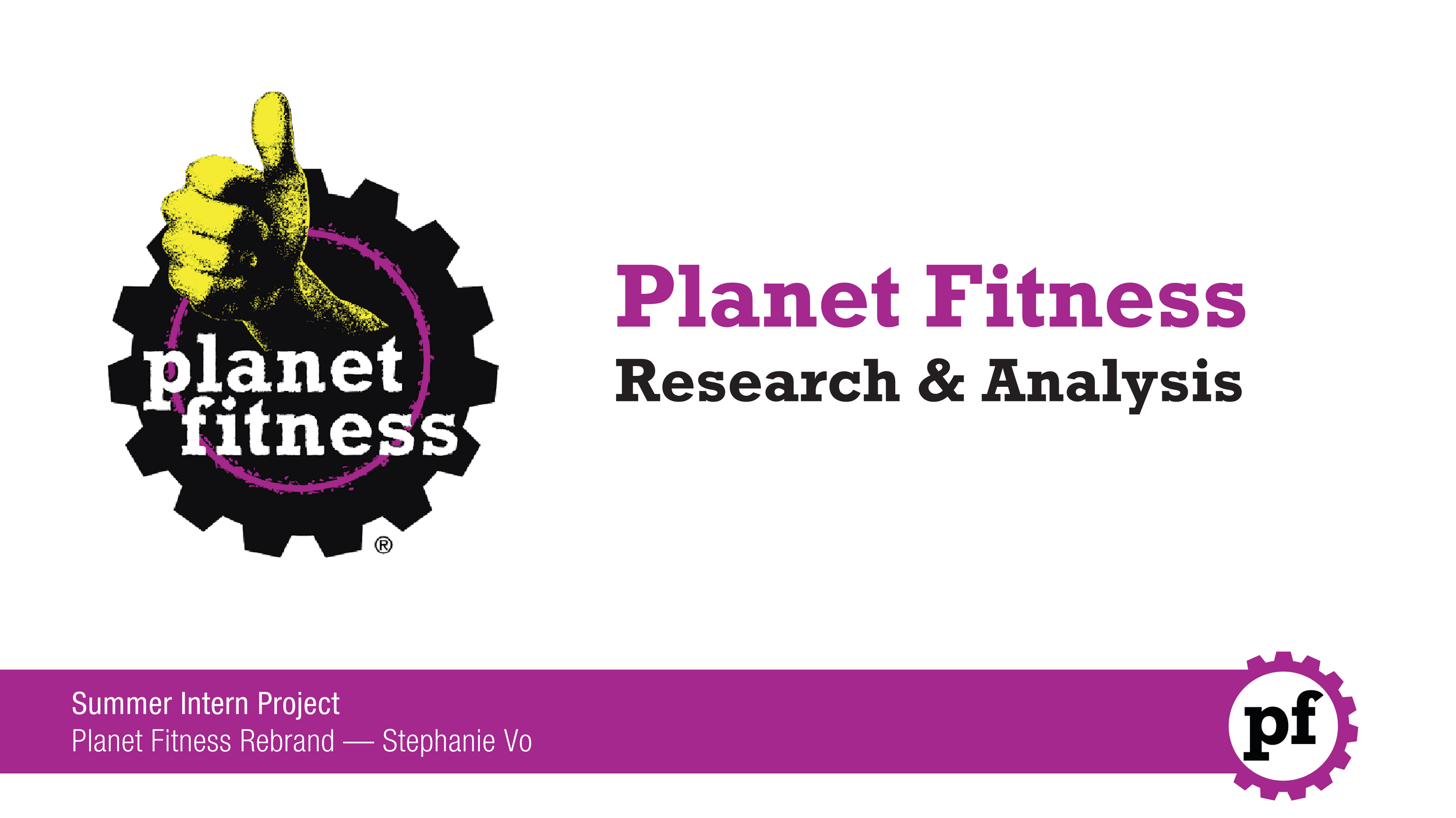
PLANET FITNESS (2024)
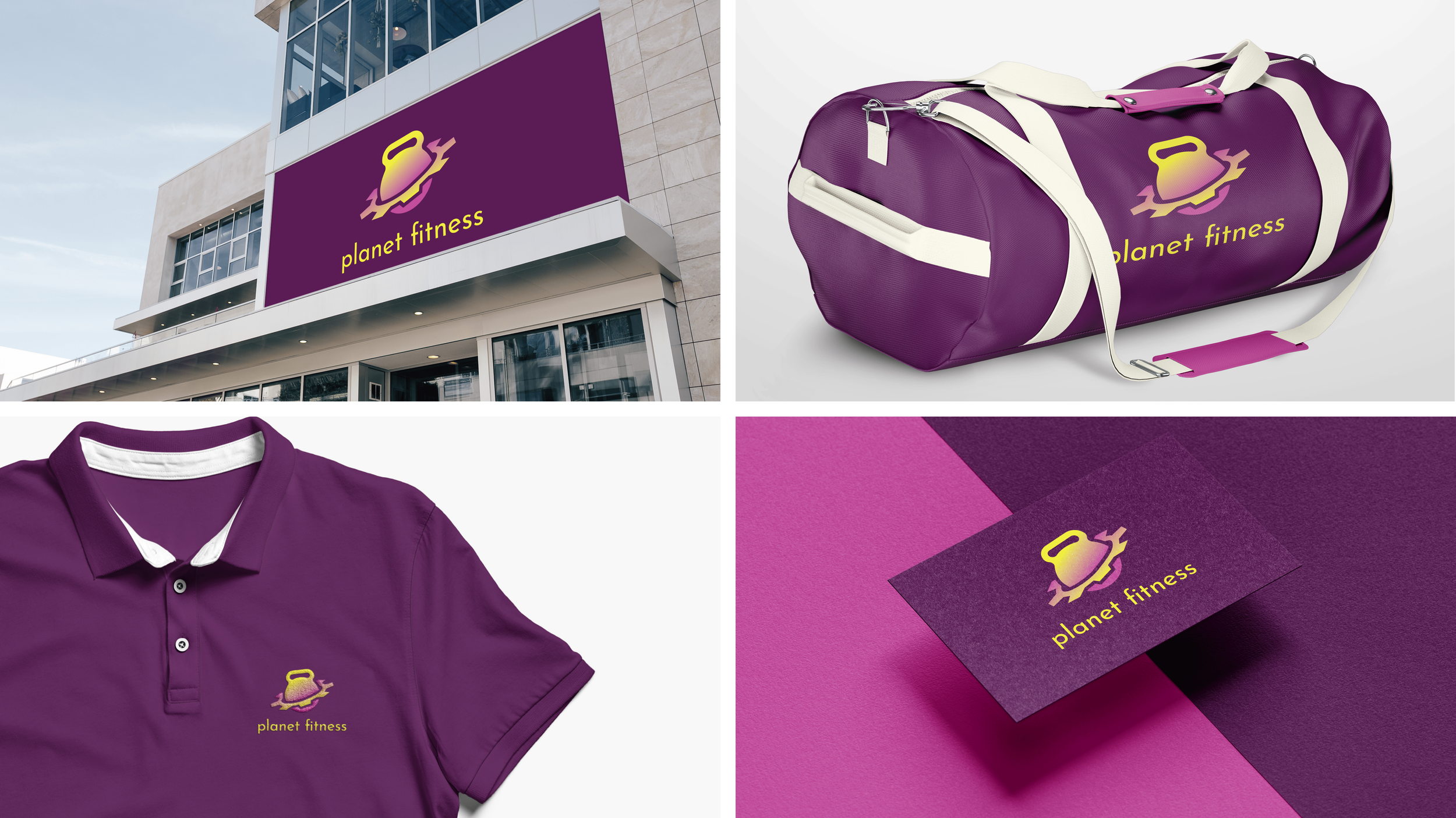
Rebranding | Print Design | Presentation Design
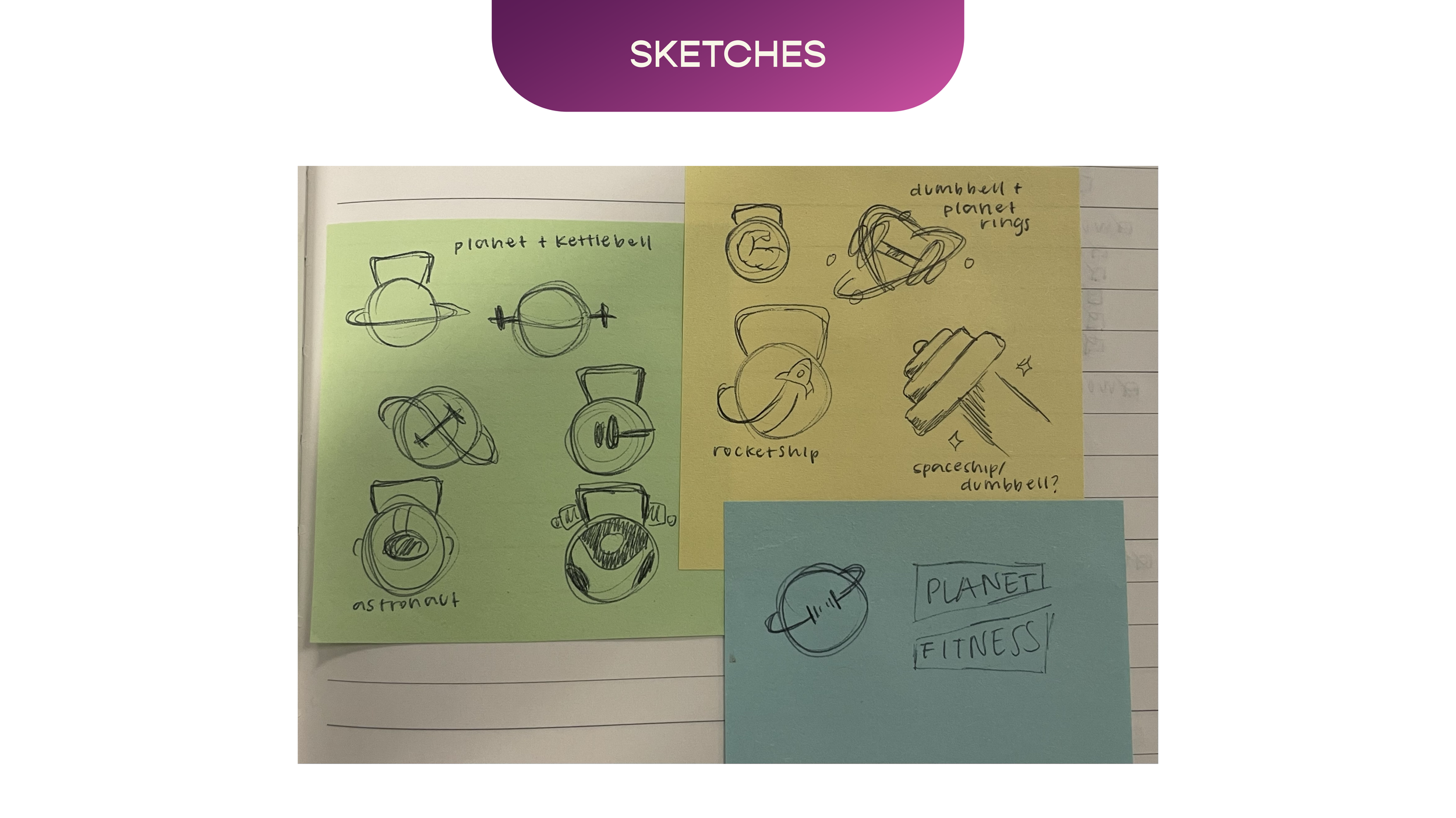
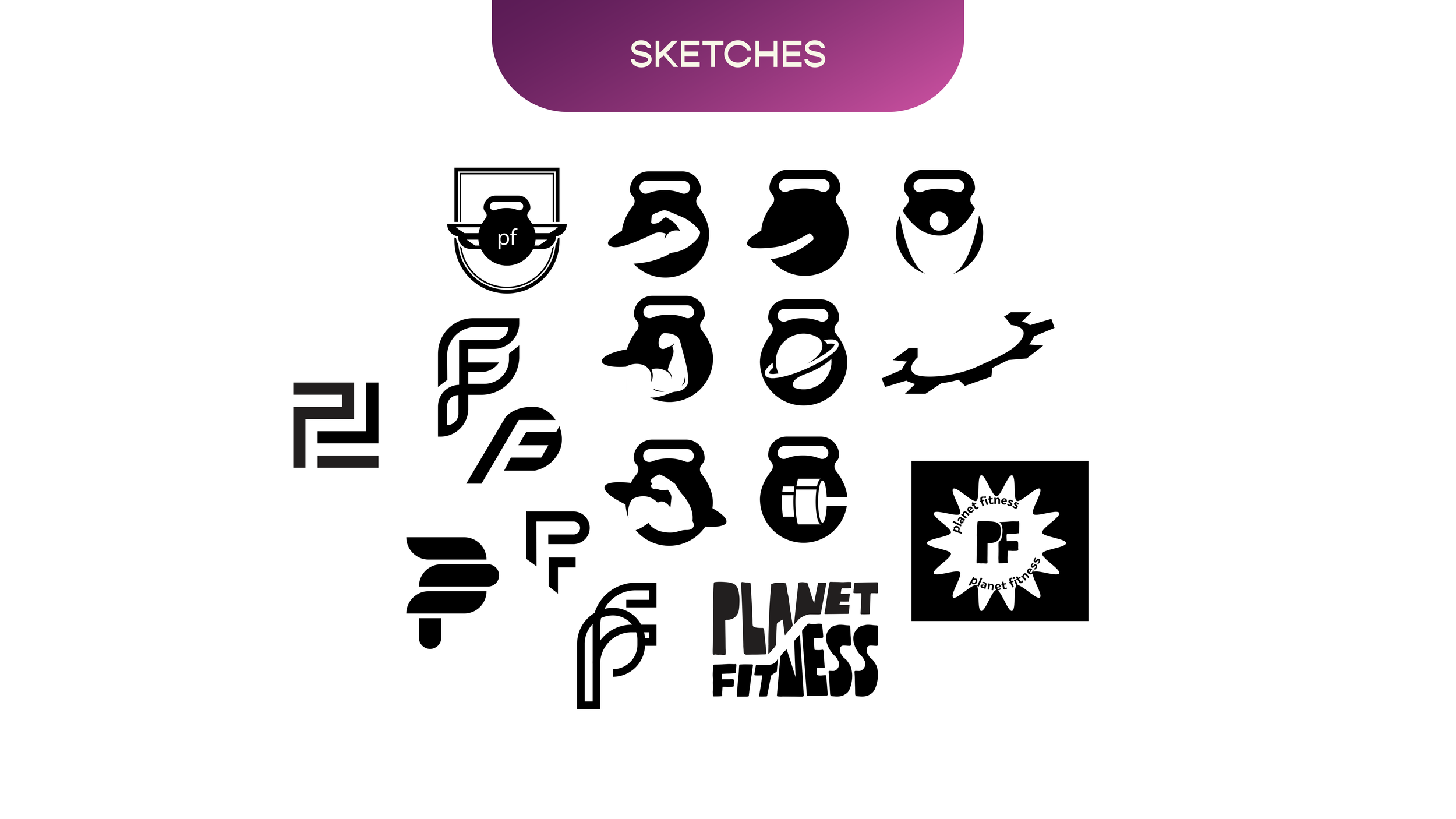
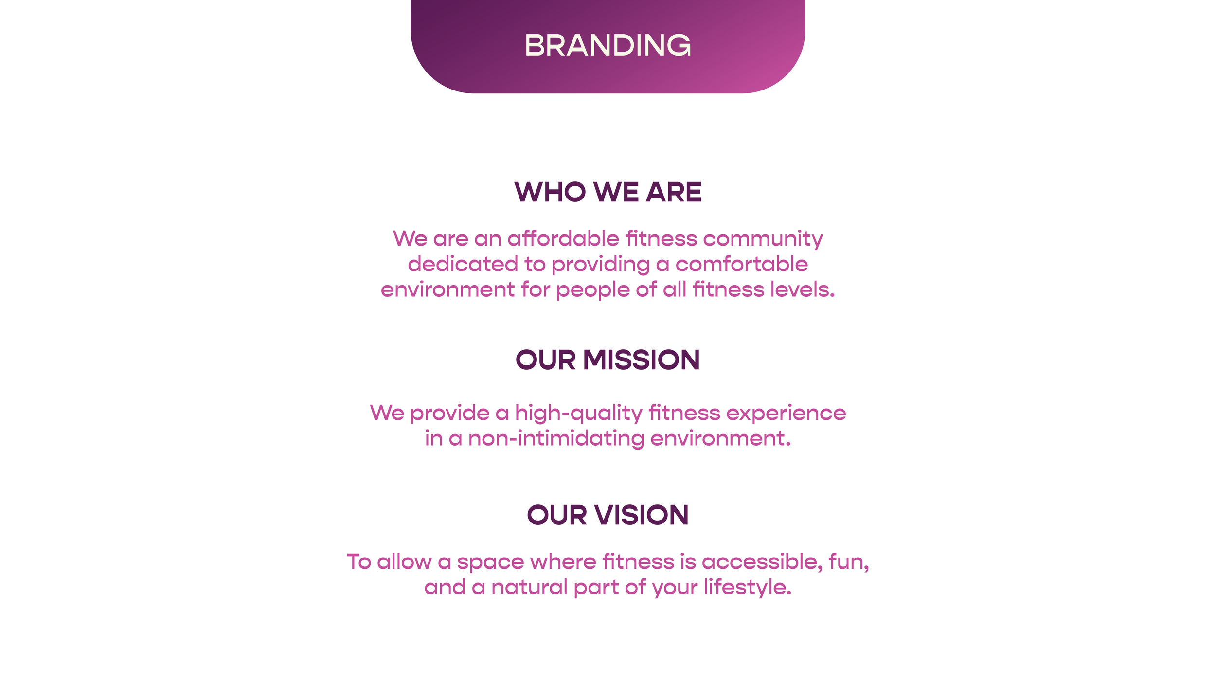
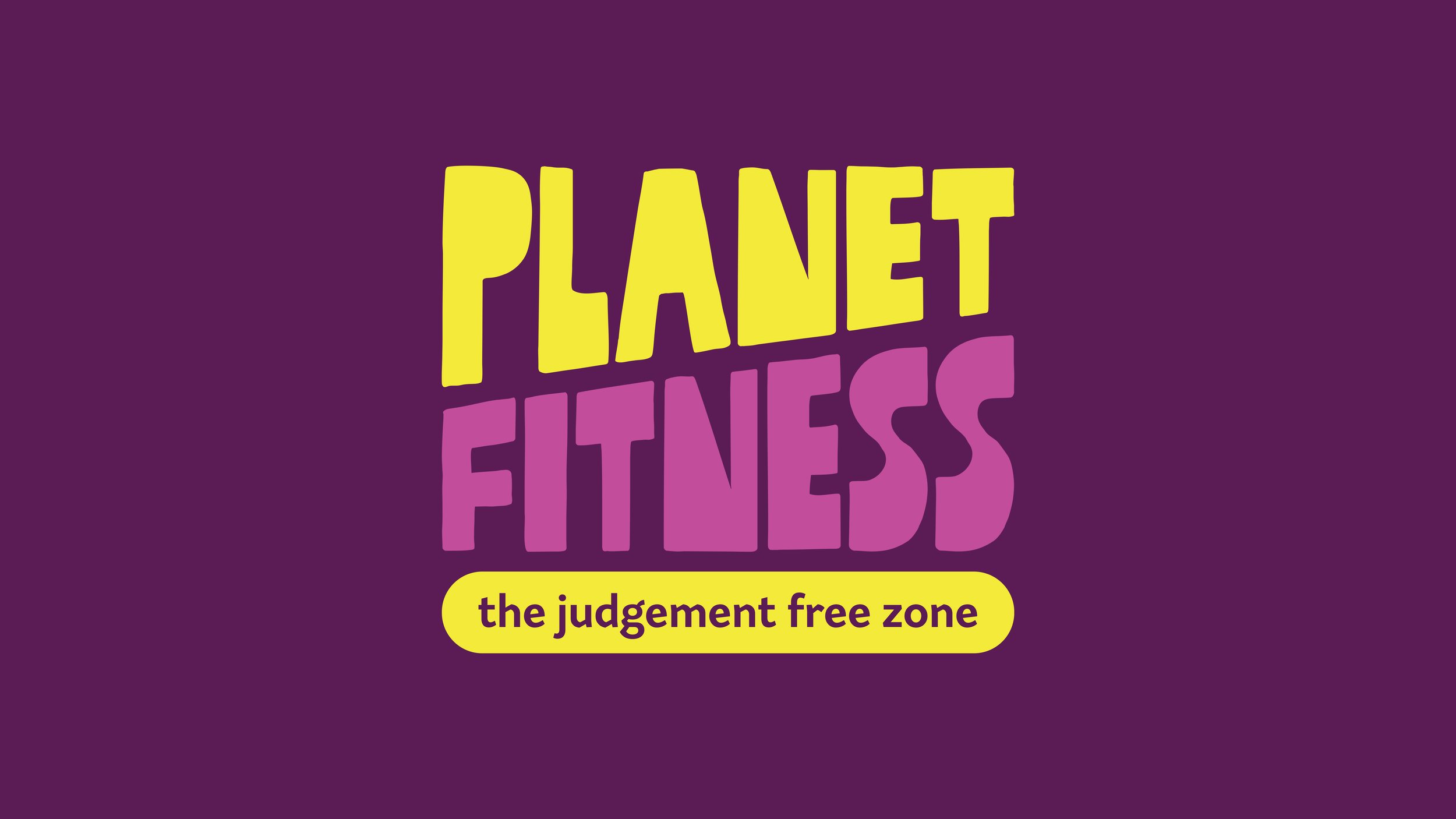
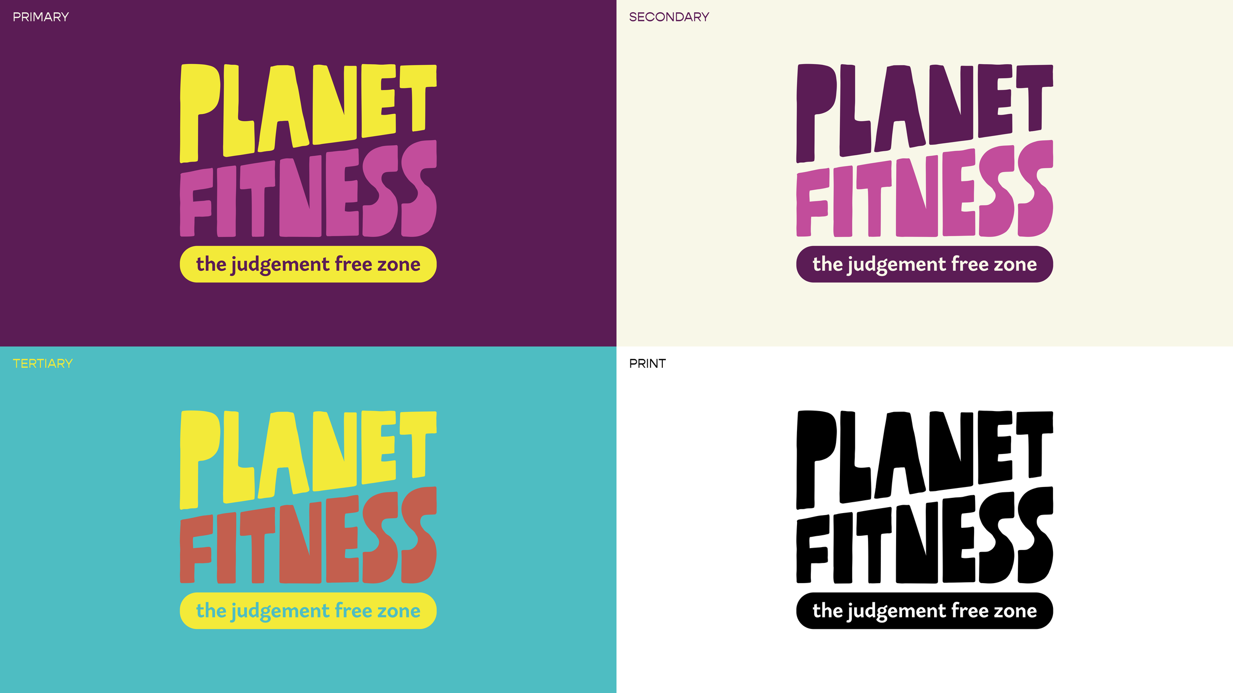
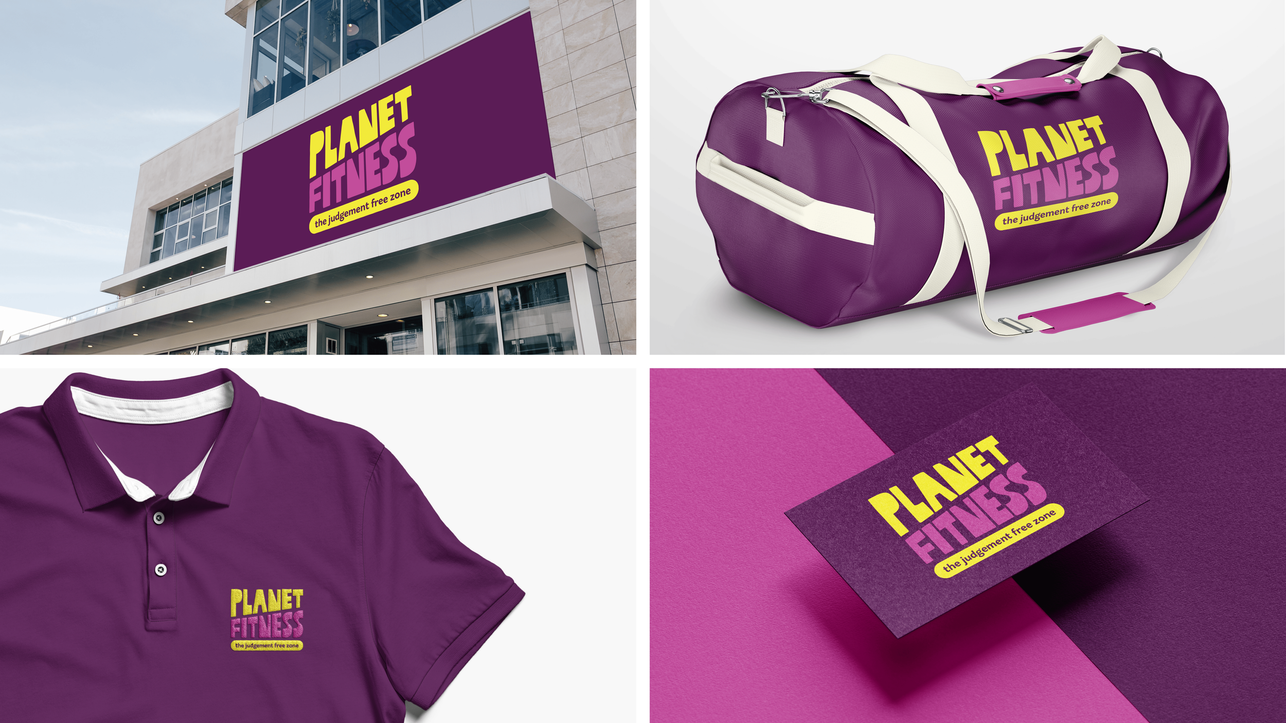
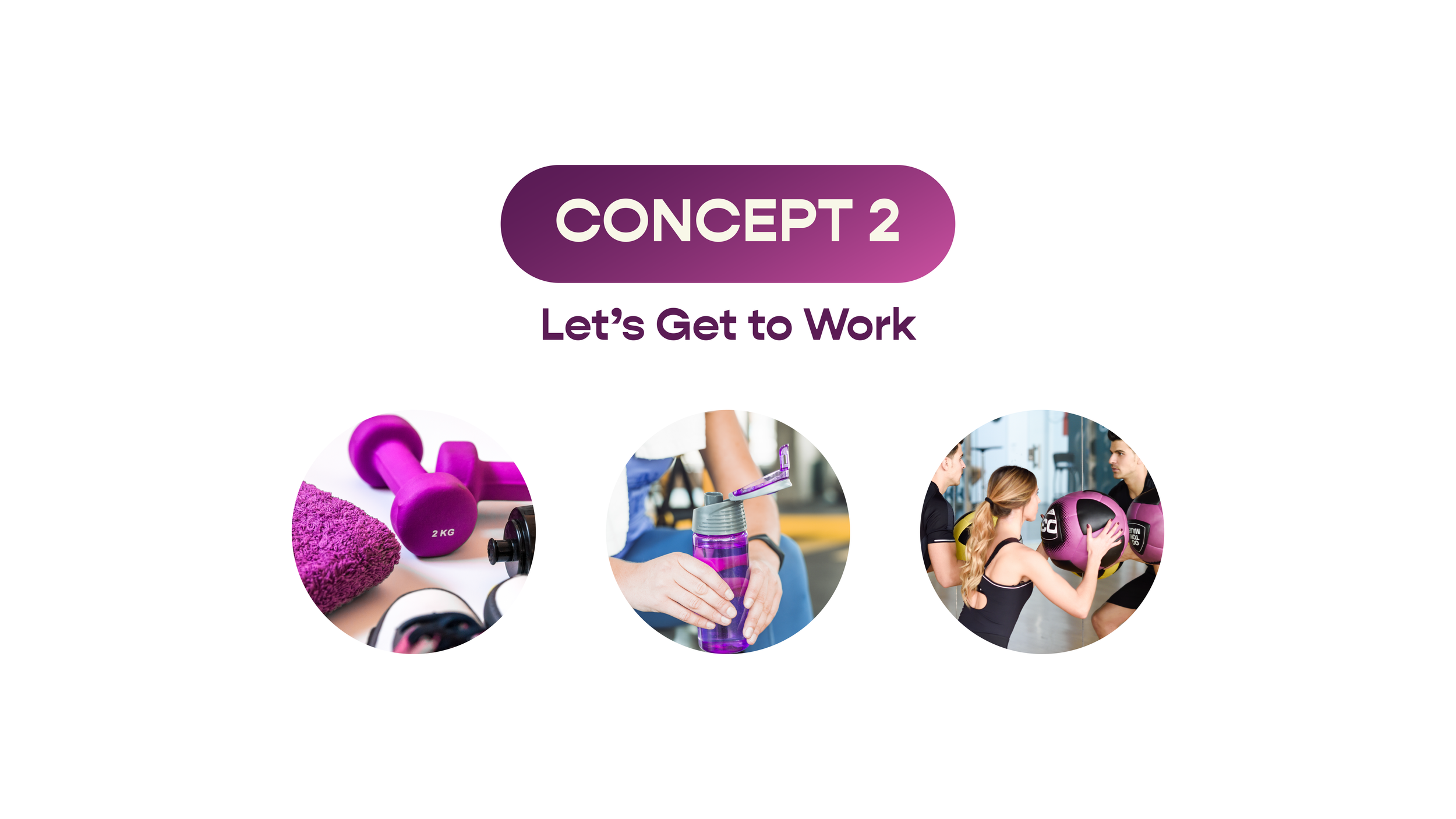
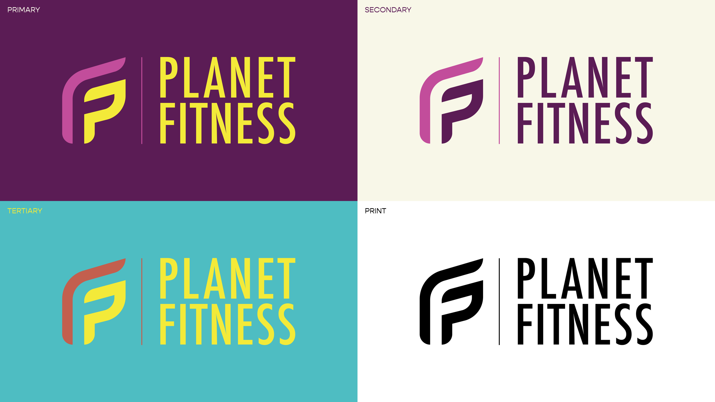
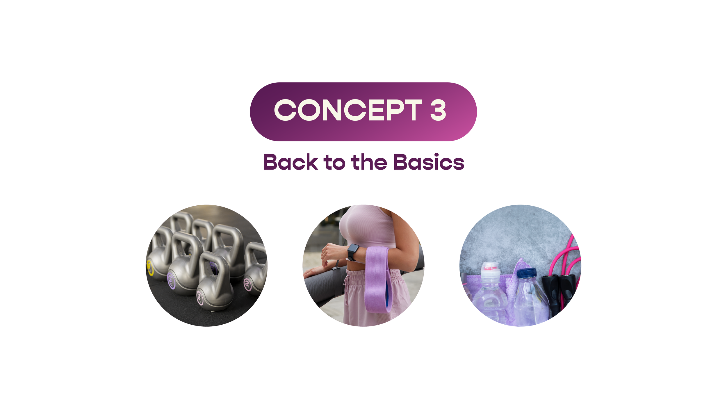
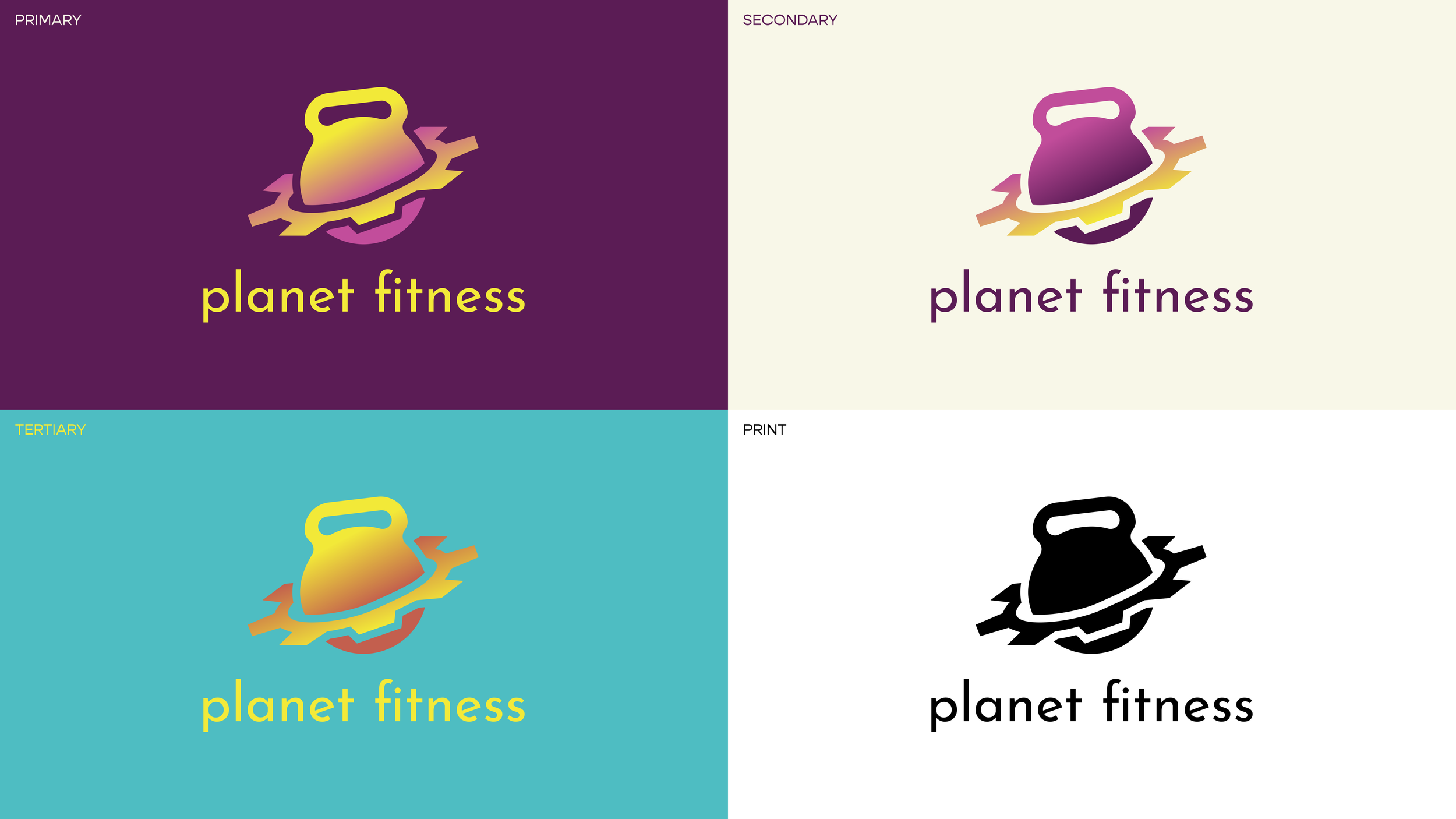
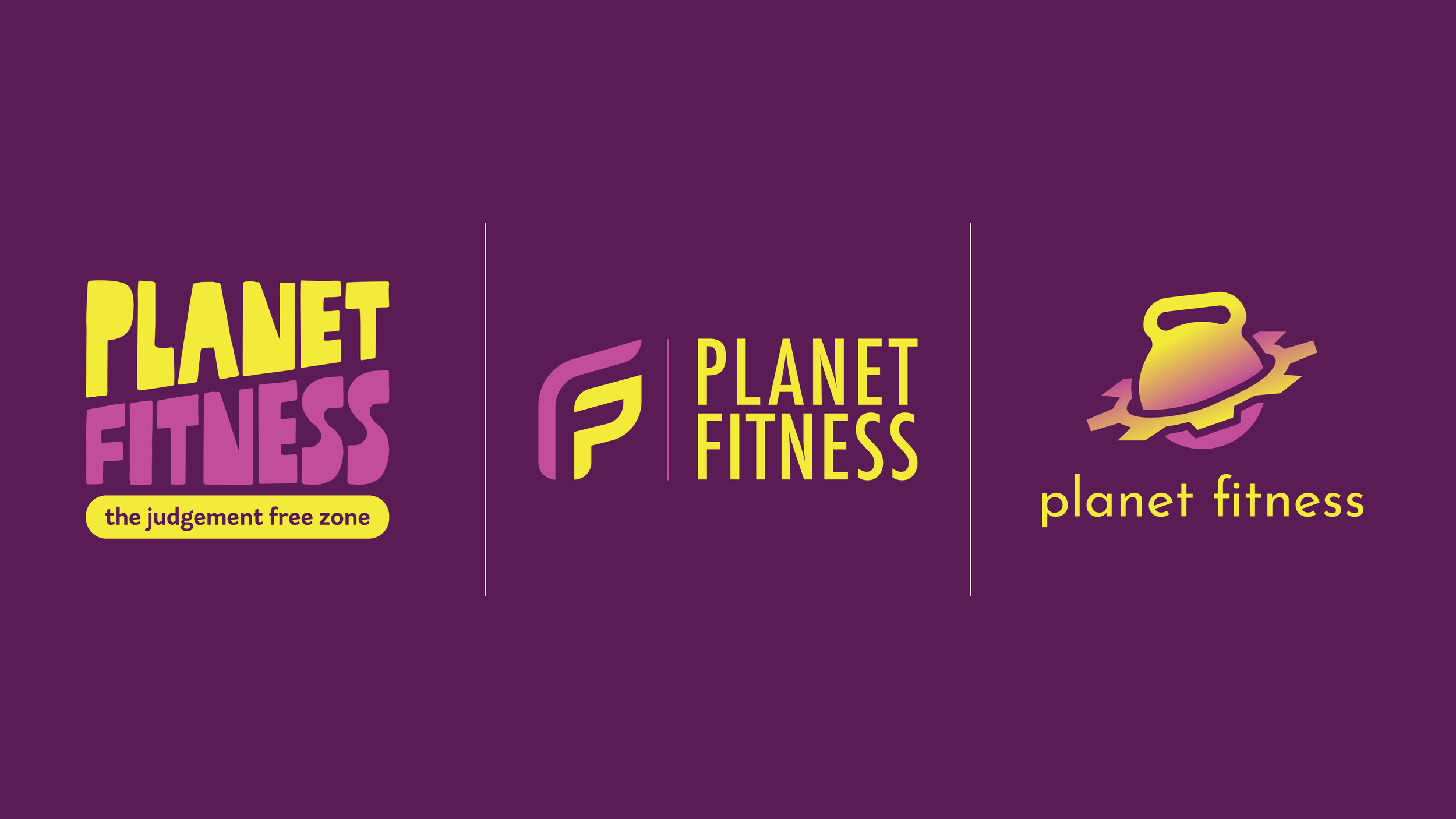
As the graphic design intern at TruePoint Communications, I was tasked with a rebrand project for a well-known company that needed an upgrade in its branding. The project entailed research and analysis on the brand and conceptualizing three potential logo concepts.
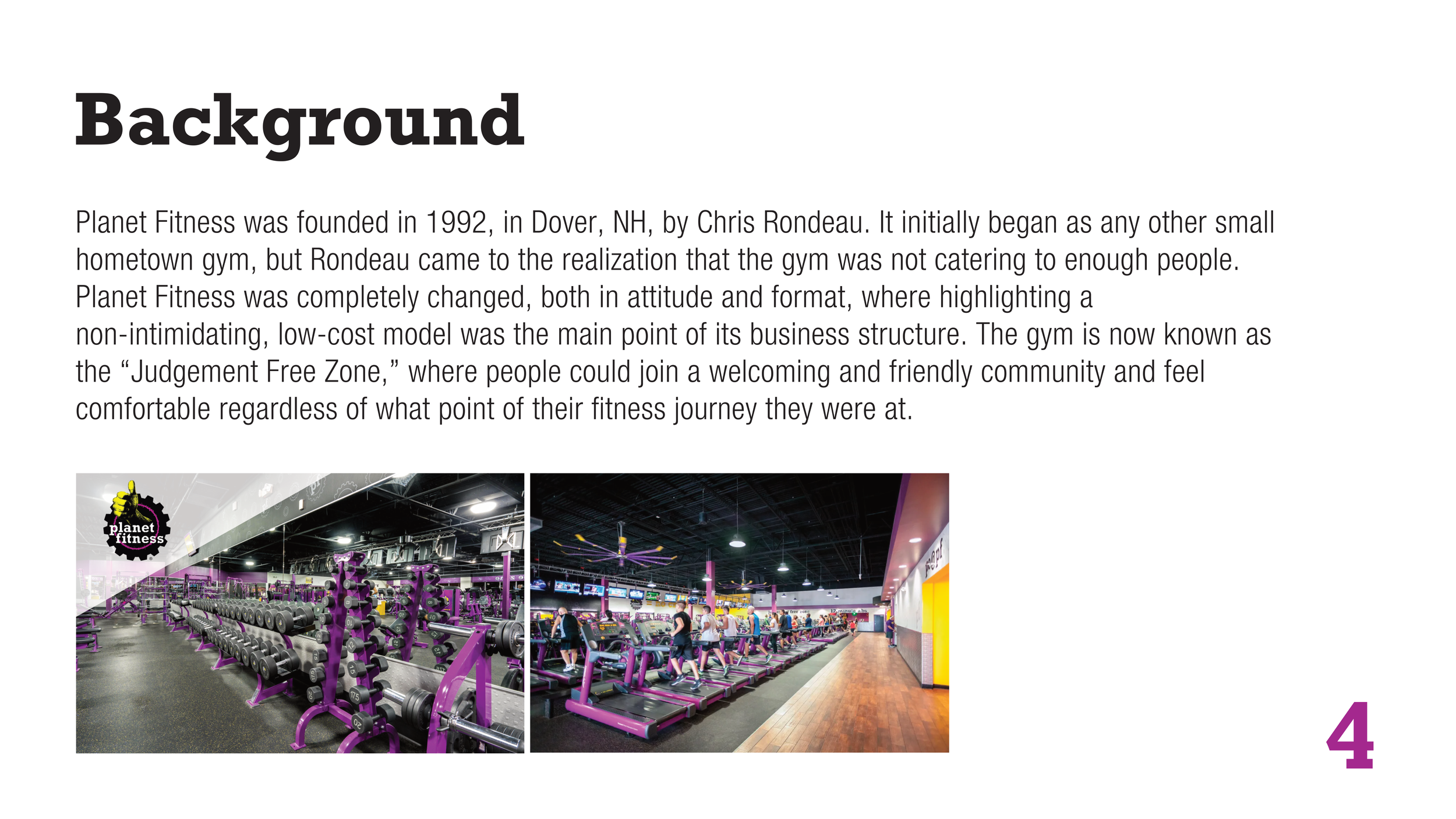
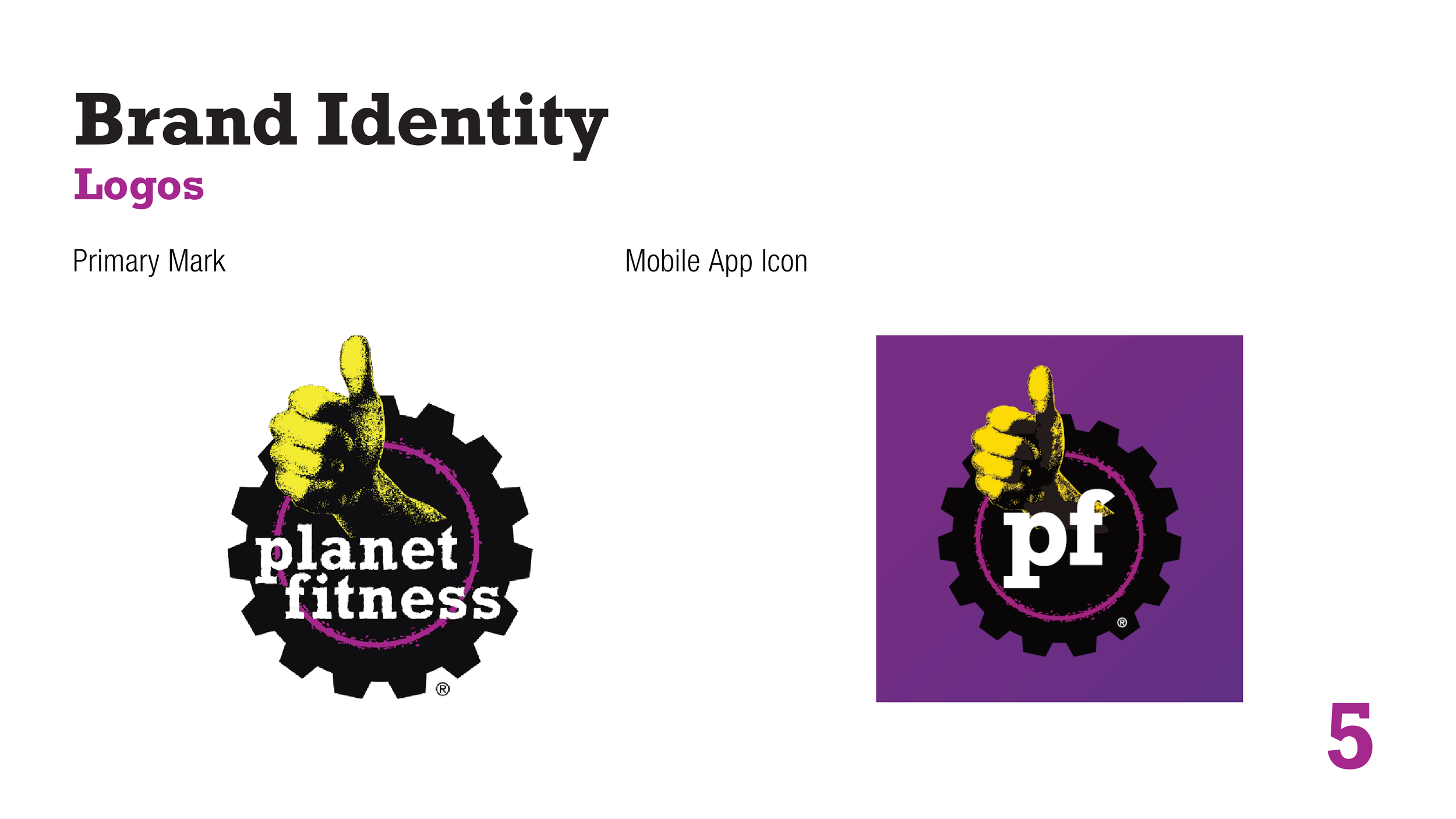
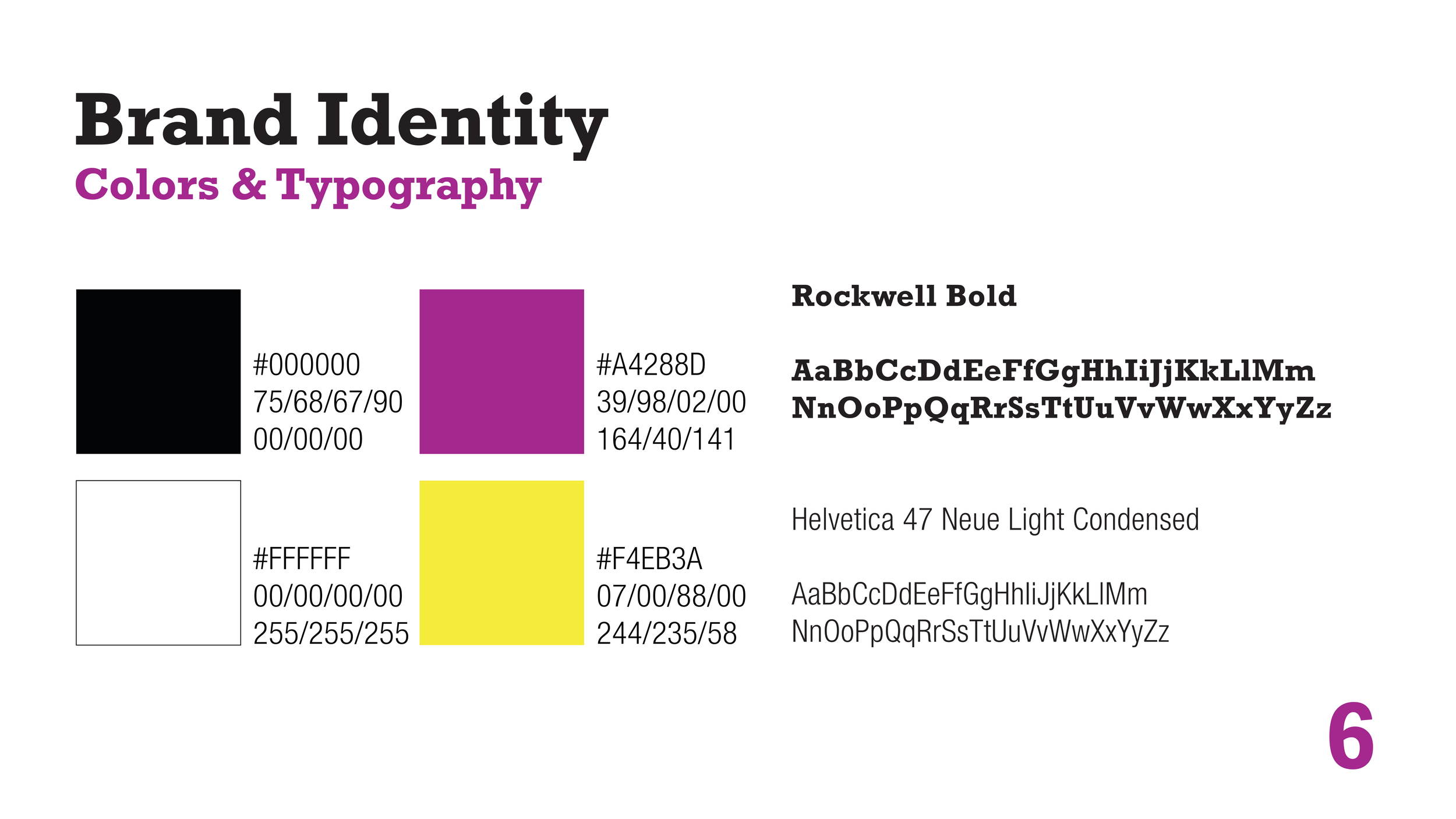
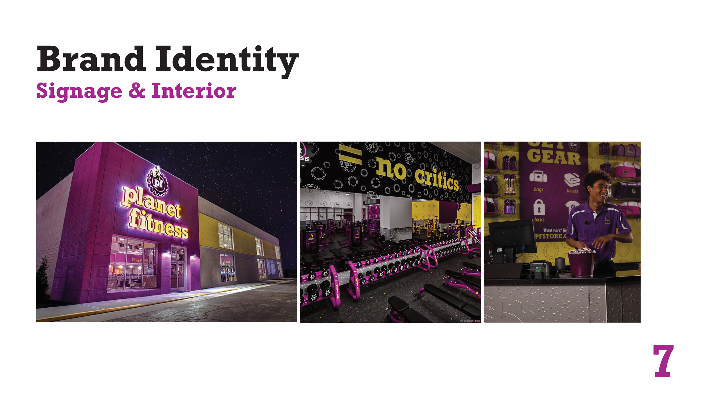
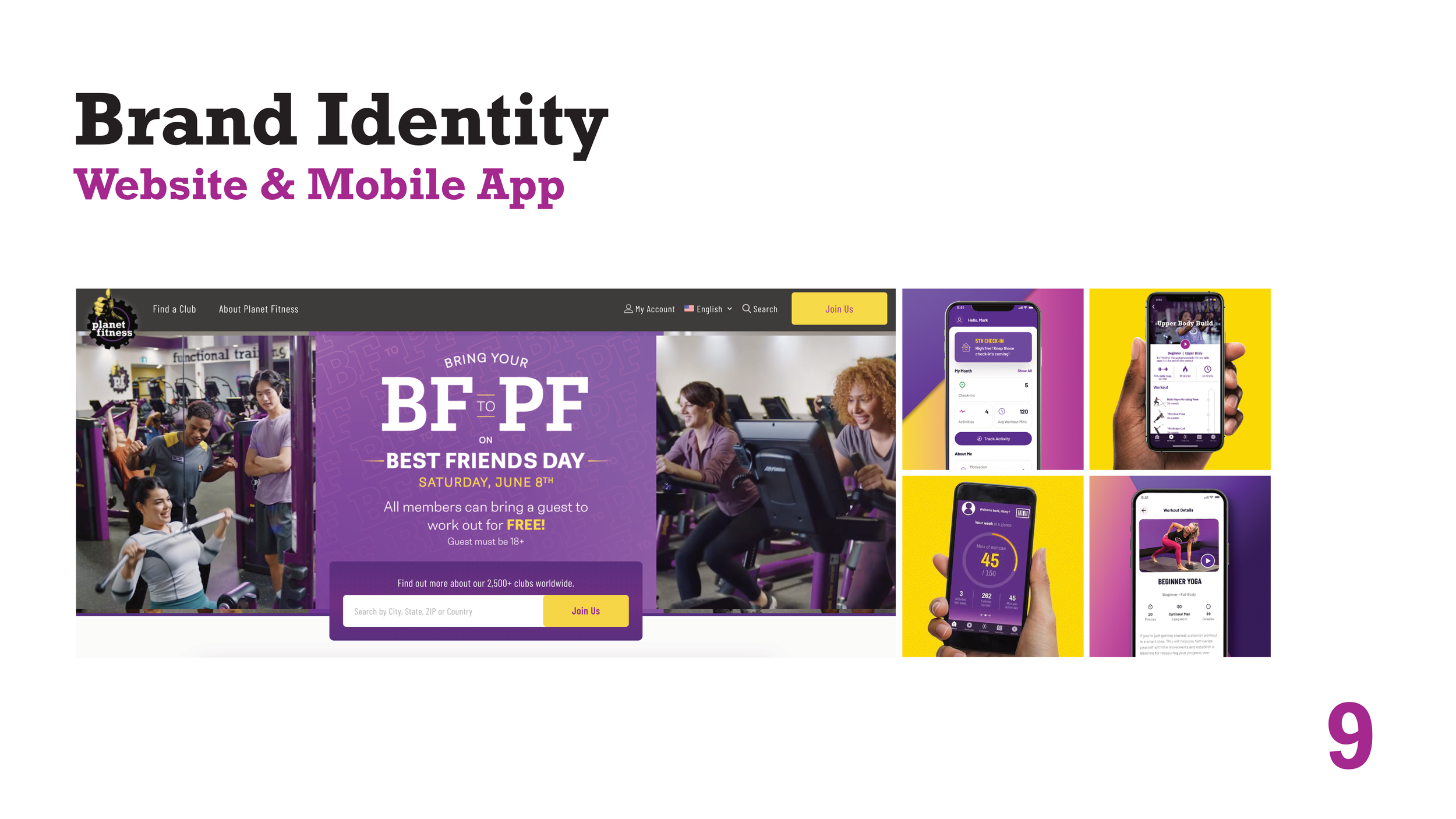
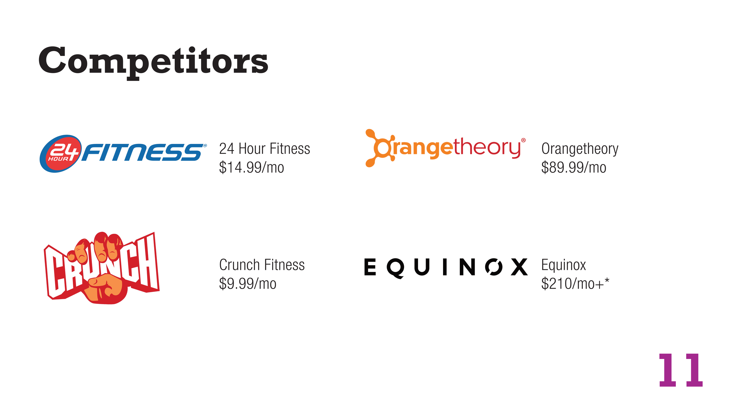
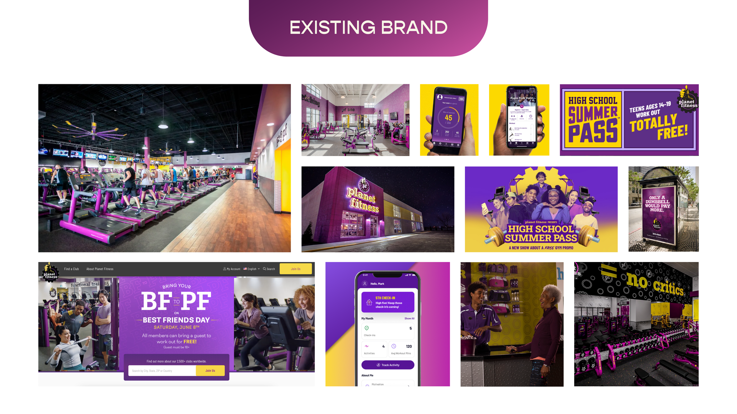
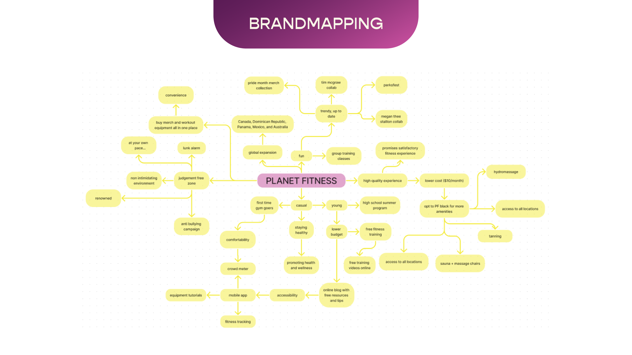
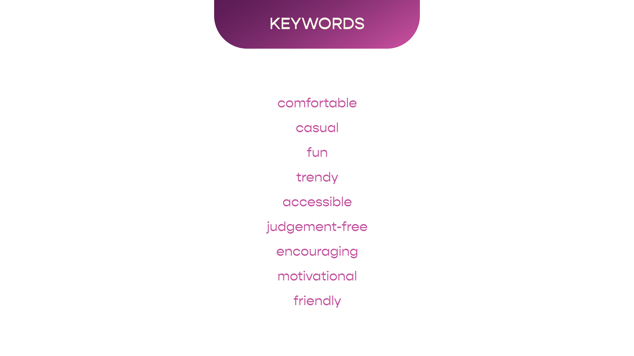
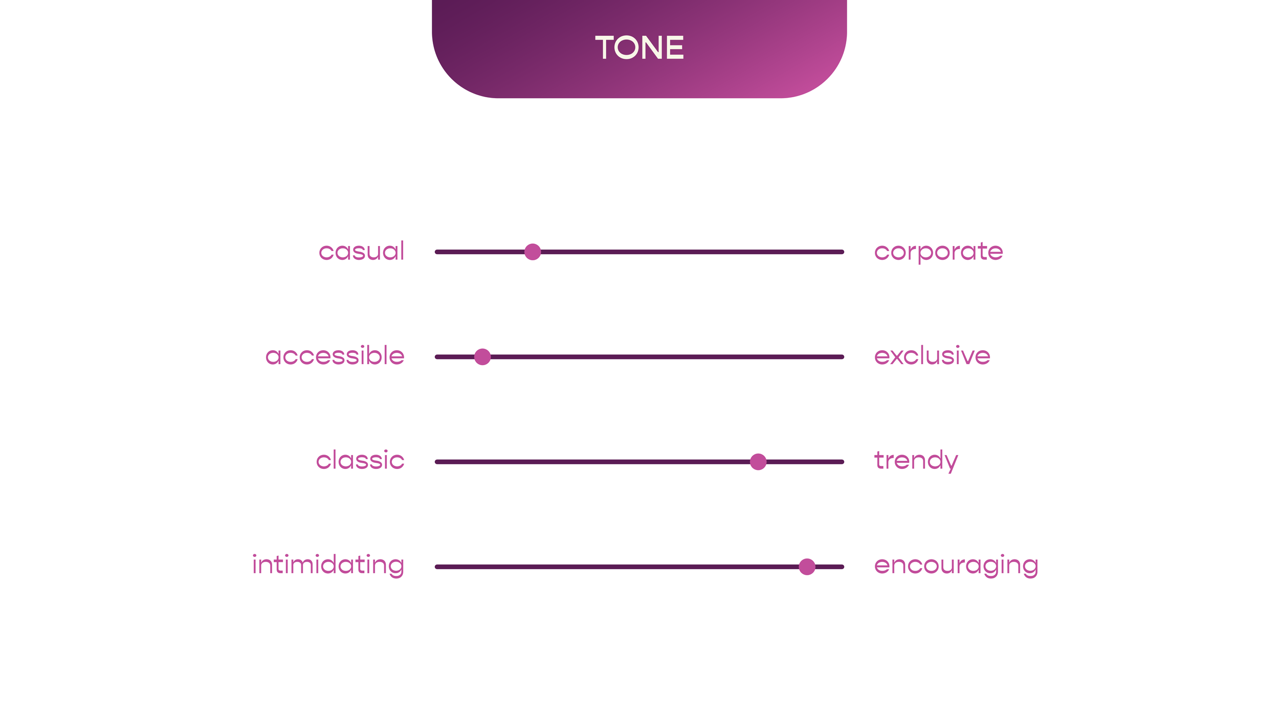
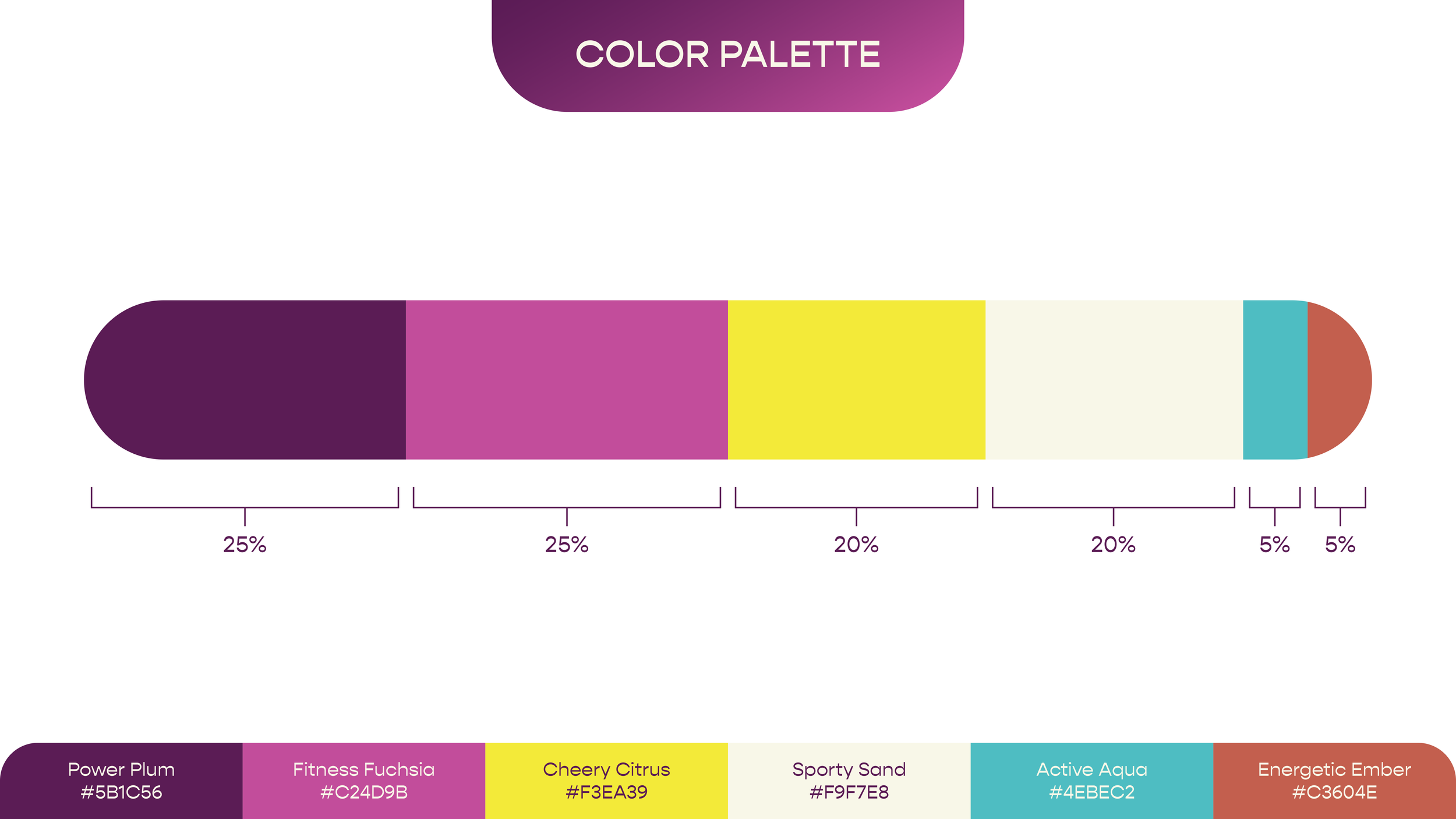
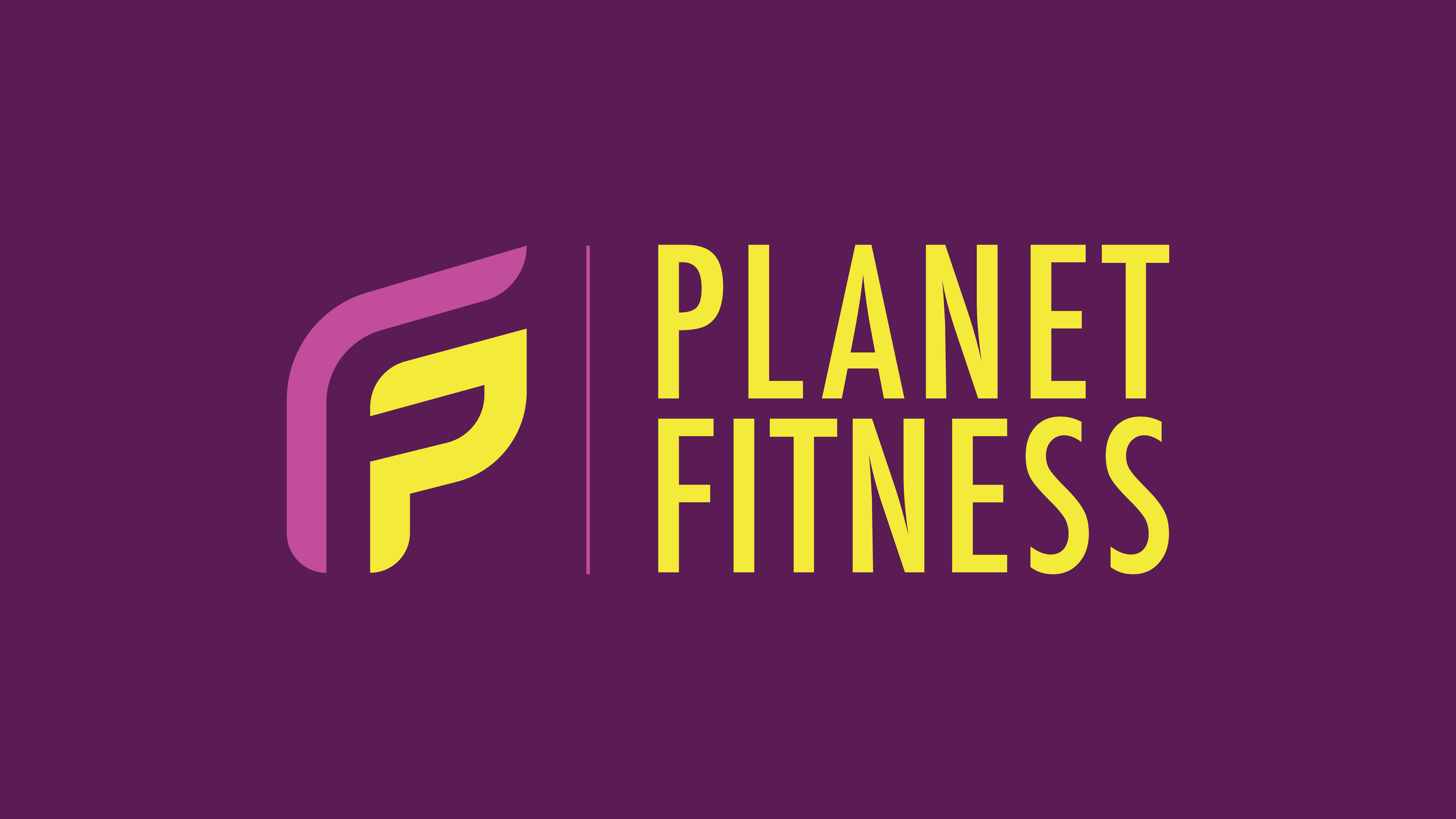
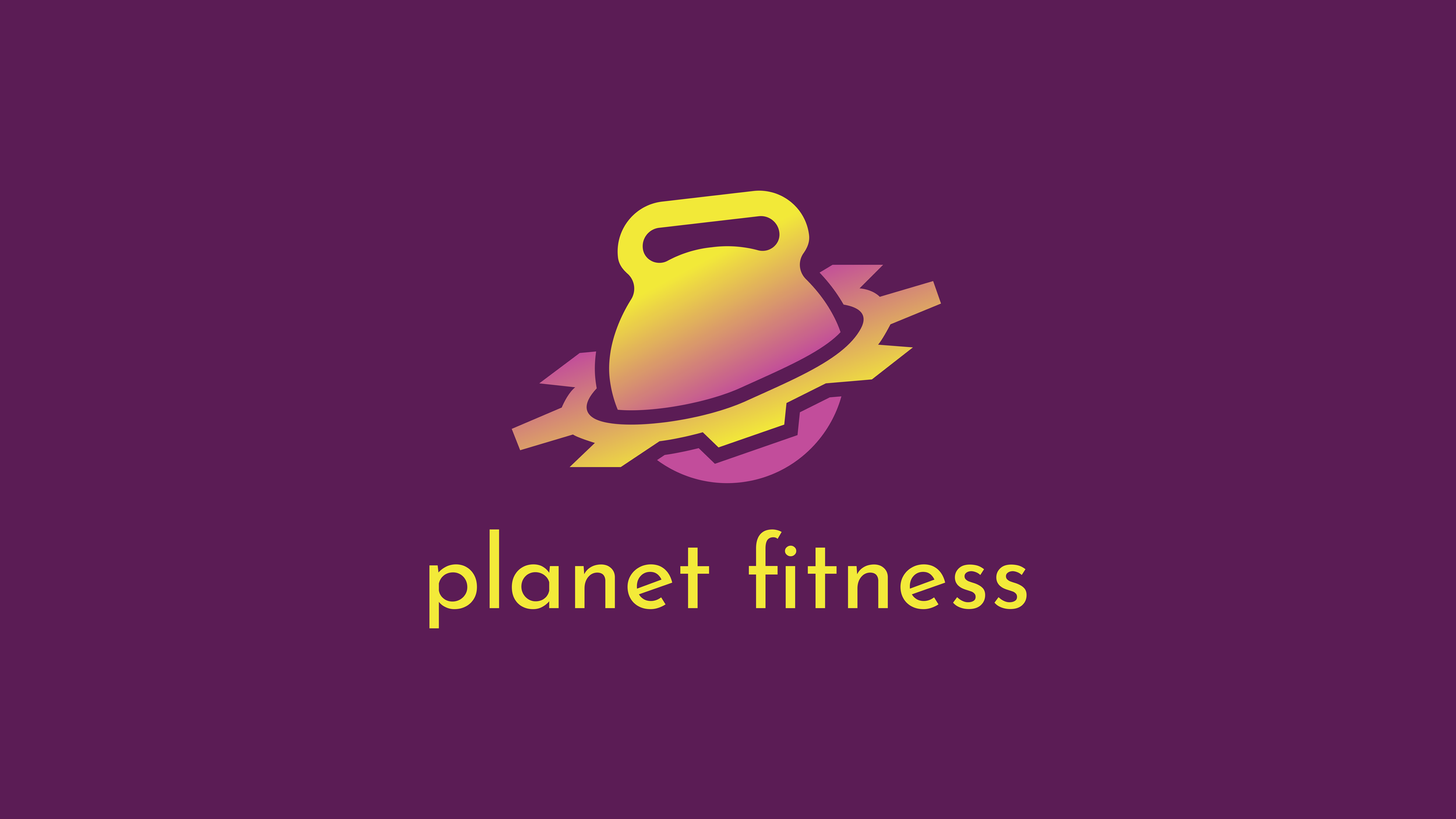
Planet Fitness, known for its bright purple and yellow has been long overdue for a rebrand to keep up with the growing market of luxury fitness companies. They have outgrown their logo, which has stayed the same for over 30 years. The goal of this refresh is to create a timeless brand identity that still follows Planet Fitness’ core values of being a Judgement Free Zone.